If you are maintaining a transaction processing system, it is important to find a way to measure its performance. It may look easy, but when you dig deeper you can see its challenge.
Hourly average using simple script
To start with, I wrote a simple awk script to read the logs and print number of transactions by the hour along with average transaction time. With this, you can see which hours are bad and which hours are good. How the average transaction times impacts the number of transactions processed in an hour. This simple code helped us always. But this doesn’t give any other insights. Maybe the transactions involved in impacted hours are of a particular type and are suppose to take long. To get a more granular view, I updated the program to distribute the transaction times over multiple time intervals. This gave us a histogram. This is better than before but still did not solve the problem.
The problem with Average
The problem with averages is there they are sensitive to noise. Average can easily change just from the introduction of a single transaction with which took a very long time or from the introduction of a single wrong data with a large negative value.
If we are to provide performance data, the information we gathered using the awk script is not easy to interpret as there are multiple numbers. Best would be if we could get one single number to tell how good or bad, we are performing. Reporting the 50-percentile mark or median as the measure of performance is better, as it is a single value telling us within how much time 50% of your transactions got processed.
Visualizing performance measure
Supporting the data with a graph is the best way to convey performance information to anyone and they look more convincing on a presentation.
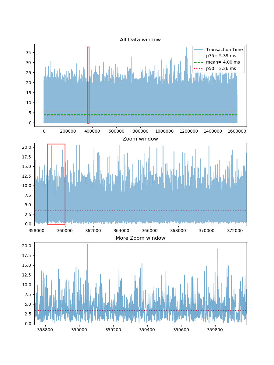
In reality, there can be more than a million data points in a day’s log file for many transaction processing systems. I considered 1.6 Million data. I found that its difficult to view granular data from a graph with so many data points. The below figure shows a way I came up with to show the complete data in one graph and created 2 additional windows for zooming.

Below is the python code that generated the above graph in jupyter notebook. With some small tweaks it can be applied to real logs to display performance data.
The first part is more of an utility object to draw the red rectangle for zooming data.
%matplotlib notebook
import numpy as np
import matplotlib.pyplot as plt
import matplotlib.patches as patches
from matplotlib.patches import Rectangle
from matplotlib import gridspec

class DraggableRectangle:
 def init(self, rect, data, zoomWidth, src, zoom, otherRect = None, otherZoomWiidth = 0, moreZoom = None):
     self.rect = rect
     self.data = data
     #Primary window details
     self.zoomWidth = zoomWidth
     self.axsrc  = src
     self.axzoom = zoom
     #Secondary optional window details
     self.otherRect = otherRect
     self.otherZoomWiidth = otherZoomWiidth
     self.axMoreZoom = moreZoom
 def connect(self):
     #connect to all the events we need
     self.cidpress = self.rect.figure.canvas.mpl_connect(
         'button_press_event', self.on_press)
 def on_press(self, event):
     #on button press we will see if the mouse is over the desired window
     if event.inaxes == self.axsrc:
         x = int(np.rint(event.xdata))
         # Restricting the window to go beyond the lowest point
         if x - (self.zoomWidth/2) < 0:
             x = 0
         else:
             # (x - zoomWidth/2) is used to make the point of click the center of the box
             x = int(x - (self.zoomWidth/2))
         self.rect.set_x(x)
         self.zoomStart = x
         self.axzoom.set_xlim(x , x + self.zoomWidth)
         self.axzoom.set_ylim(float(self.data[x:x+self.zoomWidth].min()-0.5),
                              float(self.data[x:x+self.zoomWidth].max()+0.5) )
         if self.otherRect == None or self.otherZoomWiidth == 0:
             self.rect.figure.canvas.draw()
         else: #If second window is present
             self.otherRect.set_x(x)
             self.otherRect.set_height(self.data[x:x+self.zoomWidth].max()+0.5)
             self.axMoreZoom.set_xlim(x , x + self.zoomWidth)
             self.axMoreZoom.set_ylim(float(self.data[x:x+self.otherZoomWiidth].min()-0.5),
                              float(self.data[x:x+self.otherZoomWiidth].max()+0.5) )
             self.rect.figure.canvas.draw()
 def disconnect(self):
     #disconnect all the stored connection ids
     self.rect.figure.canvas.mpl_disconnect(self.cidpress)
The part below has the random number generator that generates 1.6 Million data points. I used gamma distribution to ensure the distribution is slightly skewed to mimic real-world data. Let’s say these numbers are the time taken by transactions in a system. You can also see the output it generated.
 data = np.random.gamma(2, 2, 1600000)
 print("Size: " + str(np.size(data)))
 p50 = np.percentile(data, 50)
 mean= np.mean(data)
 p75 = np.percentile(data, 75)
 print("mean  : " + str(mean))
 print("median: " + str(np.median(data)))
 print("p50   : " + str(p50))
 print("p75   : " + str(p75))
Size: 1600000
mean : 3.9988995823029883
median: 3.3528767118262213
p50 : 3.3528767118262213
p75 : 5.383546573332462
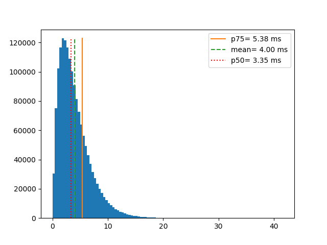
From the above numbers, you can see that median and the 50 percentile marks are exactly the same. Also notice that when 50% of your transactions are taking less than 3.35 (in some unit of time) but your average or mean transaction is time is higher than that. The mean is 3.99 or roughly 4. If you report mean it may make your system look bad (in this case) or better just because there are few transactions that took exceptionally longer or because there are few errors while measuring the transaction time and their values are in negative.
Below you can see how the data is distributed along with the code to make this graph.
 plt.figure()
 n, bins, patches = plt.hist(data, bins=100)
 plt.plot([p75,p75], [0, n.max()], "")
 plt.plot([mean, mean], [0,n.max()], "--")
 plt.plot([p50, p50], [0,n.max()], "r:")
 plt.legend(('p75= {:.2f} ms'.format(p75), 'mean= {:.2f} ms'.format(mean),
            'p50= {:.2f} ms'.format(p50)), loc='best');

The next part of the code is to visualize the data point.
 zoomWidth_1 = 15000
 zoomWidth_2 = int(zoomWidth_1 / 12)
 allData = plt.subplot(gs[0])
 allData.set(title='All Data window')
 plt.plot(data, alpha=0.5)
 plt.gcf().canvas.draw()
 Zoom Window
 slicedData_1 = plt.subplot(gs[1])
 slicedData_1.set(xlim=(0, zoomWidth_1),
                    ylim=(float(data[0:zoomWidth_1].min()-0.5), float(data[0:zoomWidth_1].max()+0.5)),
                    autoscale_on=False,
                    title='Zoom window')
 plt.plot(data, alpha=0.5)
 plt.gcf().canvas.draw()
 More Zoom window
 slicedData_2 = plt.subplot(gs[2])
 slicedData_2.set(xlim=(0, zoomWidth_2),
                    ylim=(float(data[0:zoomWidth_2].min()-0.5), float(data[0:zoomWidth_2].max()+0.5)),
                    autoscale_on=False,
                    title='More Zoom window')
 plt.plot(data, alpha=0.6)
 plt.gcf().canvas.draw()
 Rectangle in Zoom window
 slicedData_1 = plt.subplot(gs[1])
 rect_2 = Rectangle((0,-0.2),zoomWidth_2,data[0:zoomWidth_1].max()+0.5,
                 linewidth=2,edgecolor='r',facecolor='none', alpha=0.7)
 dr_2 = DraggableRectangle(rect_2, data, zoomWidth_2, slicedData_1, slicedData_2)
 plt.gca().add_patch(rect_2)
 dr_2.connect()
 Rectangle in allData window; should also adjust the rectangle in zoom Window
 allData = plt.subplot(gs[0])
 rect_1 = Rectangle((0,-0.2),zoomWidth_1,data.max()+0.5,
                     linewidth=2,edgecolor='r',facecolor='none', alpha=0.7)
 dr_1 = DraggableRectangle(rect_1, data, zoomWidth_1, allData, slicedData_1, rect_2, zoomWidth_2, slicedData_2)
 plt.gca().add_patch(rect_1)
 dr_1.connect();